 _
_Viewed 11869 times | words: 3401
Published on 2019-12-30 13:34:44 | words: 3401
Recently (September 2019) I posted two articles on the theme "assessing systemically": on the business side and the political side.
Anyway, no assessment can be carried out without an appropriate amount of data.
Moreover, within the context of European Union integration, there must be a certain amount of at least harmonization of data used to chart progress.
Assessing systemically: what "data" does imply
If you want to assess a system, you need perspective- i.e. need also to observe it from different viewpoints, and possibly from outside the system itself (or using an external framework of reference).
As for the title, I am referring specifically to open data (the link outlines the concept and talks about an example).
In business, harmonization usually works where there is either a leading party, or a third-party that is acknowledged to be superpartes
About the latter: e.g. after a M&A between equals- frankly, I have doubt that any merger will ever be between equals- eventually, in my experience and observations also from others I worked with, eventually the balance becomes unbalanced.
So, let's say anyway that harmonization, one way or the other, is needed.
To play it safe, if you want to harmonize European Union toward further integration, a reality check is using both data that are from within the EU as designed by EU, and data from EU that is "harmonized" toward something else.
Hence, my use of open data from both EU sources (e.g. Eurostat or ECB) and UN sources.
I do apply the same with Italy, my birthplace: I use both data from the national statistics office, other local and national sources, and Eurostat.
What are open data? I will let you read Wikipedia for a collection of definitions.
In my case, I consider mainly data from local and national authorities and international institutions that enable individual and corporate citizens to see what is going on, to keep the pulse.
Furthermore, I consider open data something that has a "business as usual" element- in business as well as with national statistics, the old "lies, damned lies, statistics" is always in the back of your mind whenever you cannot access raw data.
So, a continuously updated stream, possibly right after the fact or passing through layers that aren't within the same chain-of-command is a way to avoid that data are "morphed" out of recognition.
In business, there are other consequences on a time-delay on collection, processing, distribution of data.
I will not tell share specific examples (where, how, when) over the last 30+ years, but e.g. sometimes instead of having monthly data collected at the end of the month, to be then processed one-two weeks later, and then transferred to a third-party that needs to take action on them (e.g. a customer paying an invoice produced based on those data), maybe it is better to find an agreement to have and deliver incomplete data before the end of the month, and then forward the resulting document to the third-party that will act on it.
In some cases, you will reach an agreement to e.g. have interim processing and have as complete as you can data by, say, end of month minus two days, process on end of month minus one, and then deliver on the same day the resulting information.
What would happen to what is related to the last day or two? Depends- sometimes, you add a forecast, and then fix up in the following time period; sometimes, it is more acceptable simply to "shift" that data in the following period.
Of course, it depends on your domain- see as an example the annual routine on public accounts from European Member States.
Assessing systemically: seeing the whole picture
Assessing systemically implies understanding the current conditions you are operating in, and not just those that you are aiming for.
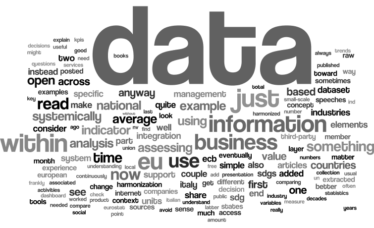
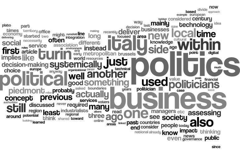
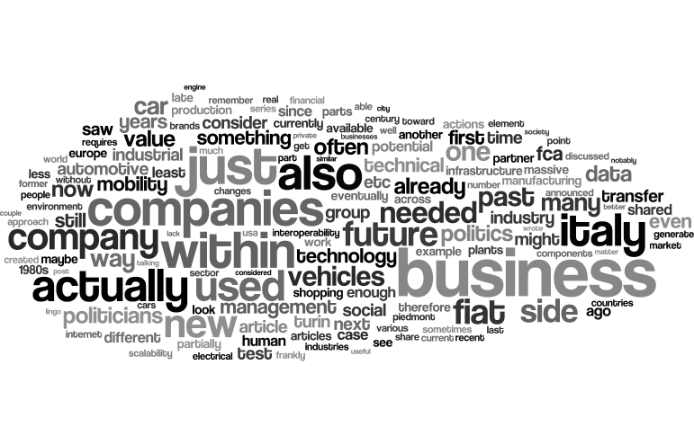
As for the two "previous elements" within the "assessing systemically" theme, I will just share the tag clouds- if you have time, you can read the articles linked above (or through the pictures):
This will all change: get ready for continuously updated and continuously available open data, derived from both private, public, and business transactions in real-time.
If you have time, a couple of weeks ago posted an article about what could happen to a couple of industries I worked in, automotive and banking, within the context of the so-called "smart cities".
Social impacts transcend the boundaries of individual companies, and will most certainly affect not just individuals or companies, but the social roles applied to both, considering that crowdsourcing within the context of lifecycle management for products and services will be run-of-the-mill quite soon.
Anyway, as the relevant prior material I published on this site (articles and books) is quite extensive and yet incomplete, you can have a look at a much shorter summary of the key themes involved, or a 11 minutes-long presentation that I shared on my YouTube channel on change.
Eventually, I will release something more structured.
But, for the time being, I started intermingling within articles bits of analysis and insight based upon open data- frankly, more confirmations from open data upon what I had collected within the "fact finding" part of my change and coordination activities over the last few decades, notably in Italy.
Thinking about organizational data filtering
I called it DataDemocracy, but it is more about "data politics" and "data transparency" than elective (i.e. the "democracy" part).
My concept is simple: do not expect "polished" applications: as I did explain above, my attitude developed first in politics, then in the Army, then in business on Decision Support Systems and then in negotiations and coordination of (services, management, software) delivery activities is probably Draconian.
I rather have data earlier in a way that it is understandable and allows to spot trends and patterns, than wait for that perfect looking Powerpoint or Keynote presentation that is delivered either one week later or filtering out most of the information according to criteria based upon the past.
Then, if it becomes useful, you can "industrialize", as we say in Italian, i.e. turn into a "business as usual".
But, as I said in business in few languages since the early 1990s, while delivering change activities, beware of those scheduled meetings that are always the same, present always the same information, within the same format, at the same time frequency.
That is the "ritual/informational"- not the "decision support" part of information dissemination.
Useful, but one should avoid mistaking the former for the latter.
Data democracy has more to do with what will be the future integration of data in our everyday life.
Actually, I should rephrase that: the "transparent integration of data"- as data are already everywhere, but we still lack, more than the legal, the mental and conceptual framework needed to all benefit from that.
My point is simply that it doesn't matter to declare "transparency" and pushing data online, unless those data are structured and accessible for those who will need to act on them, without any further "interpretation layer" that is actually a selective element.
I saw that already decades ago in practice: sometimes, more data did not imply data-driven decisions, as the assumptions adopted by the layers between the raw data and the final consumer (e.g. senior manager), to reduce data to a quantity that would fit existing presentation tools available to said consumer (from management reports to the first visible layer of an Executive Information System or dashboard or collection of Key Performance Indicators)...
...often distorted information.
Our brain isn't really able to "see" large volumes of data presented as numbers- yet, if you have a huge amount of data, some people can spot the discrepancies or trends- discrepancies or trends that would almost certainly become "blurred" (the side-effect of consolidation, summary, etc) by the traditional tools associated with converting into an indicator.
Most tools on the business intelligence market are good at making information "homogeneous", i.e. cover the "ritual/informational" part, but often the datasets delivered get layer upon layer (I remember Executive Information Systems with... hundreds of screens).
Until, eventually, an assistant or junior aide is given the task to have a look and summarize.
So everybody ends up happily covering a role: the data producers, the data processors, the data steward, the data aide, and the decision-makers receiving highly-digested data.
Then, when something happens, it is a matter of backtracking to find why it wasn't seen before: just read the 9/11 report, or the quote from a high USA official on lack of visibility of information, or watch the documentary interviewing Robert McNamara on "The Fog of War".
The latter contains interesting segments that any data scientist and any decision-maker supposedly using data to make decisions could find useful, on how number crunching could help pre-empt mistakes.
Sharing data examples
The first dataset and associated application I shared was about the ECB speeches- you can read more information (and download my keyword frequencies dataset) on ECB Speeches 1997 to 20191220 - frequencies data, subtitled: "Datamart on CSV by ECB with data up to 2019-10-25, extended up to 2019-12-20".
This is simple: a series of speeches, the "tag cloud" navigational tool for now is just an example to access all the raw information but based upon common elements, and then presenting which speeches on the ECB site contain that keyword.
The second one was released today, and is about the concept I would like to discuss today: UN SDG - EU 27 sample datamart (subset for 7 KPIs), subtitled: "to support a sample dashboard, a subset extracted on 2019-11-11".
Frankly, what matters more in this case are business experience than mathematical skills, but I will gradually add more analysis and charts built using a free tool that decades ago, when I was building Decision Support System models with senior managers from my customers in various industries o.b.o. Andersen and Comshare I was just dreaming about.
If you think by images, when you build models with 3,4,5,6 dimension of analysis (e.g. a point in time, for a specific product, in a specific region, sold via a specific channel, with a specific form of relationship, and comparing budget vs forecast vs actual, on a simple Profit-and-loss analysis with variables covering all the product or service lifecycle, that's something.
Then, add to that concepts such as that each unit of product or service sold includes also provisioning for future associated services (maintenance, third-party management of recovery or phase-out, etc), warranty, etc, and you can see why visualizing "Gordian knots" across the system is better done with pictures than with numbers.
I published in 2015 a short book on relevant data, based on "my over 25 years of experience of promoting the use of data (and tools) for decision support, first with DSS/EIS and management reporting, then with data warehousing, business intelligence, CRM, and web-based technologies."
At the link above, you can read it for free, as usual.
And, as other books (e.g. on GDPR), and the articles on this website, all based on experience and ideas inspired from my own experiences, first-hand experiences of others, and material I either studied or observed.
Now, what I learned is quite simple, when it comes to "assessing systemically", i.e. using data harmonized across a diverse organization (small or large, national or multinational, multi-industry or in a narrow domain, doesn't really matter).
To a certain degree, harmonization into a Key Performance Indicator (KPI) by necessity "blurs" structural differences.
It isn't necessarily true for each and every KPI- but I will give you just a couple of examples between the 7 KPIs that I extracted from the SDG database (UN and Eurostat).
The meaning of data: two SDG cases
As posted within an article posted on 2019-11-26 just few doubts on #national and #local challenges in #Italy and #Turin - how well we are coping with them - #industry #development #SDG #smartcity:
in conferences and on the media, often SDGs are presented as if they were something of interest for developing countries.
A significant distortion: the model represented by the SDGs really is worth looking at also in our developed countries- it is a matter of global convergence toward a social and governance model, like it or not.
The paradox is that those working on SDGs, including national statistical bureaux and multinational corporations, know fairly well that SDGs apply to both countries and companies: it is only the media and general (and, unfortunately, most of the business) public that seem to consider SDGs as a kind of "feel good initiative"
Now, within the SDG dataset that I extracted from the sources there are 342 SeriesCode, with 37 different "Units" (i.e. units of measure).
Anyway, while most KPIs are quite simple to understand, i.e. the higher the value, the better you are, or viceversa, some instead are split across different categories in different years or countries, as not all the EU countries reported the same information, with the same level of details, in each country.
So, I selected just 7 "SeriesCode" to compare EU 27 Member States on (yes, I extracted but then removed the data for UK- as it is confirmed that on 2020-01-31 Brexit will be official, no point), with just 3 units of measure.
Reason? I wanted to check on few elements concerning my focus of interest, not everything for everybody.
Then, I will share online from January 2020.
Whenever reading data and statistical tables, it is worth remembering to use your brain.
There are few books around (many can be read for free on Internet), but, in order to explain the concept about "understanding data" and "understanding context" while doing an assessments before making decisions, I will share a couple of examples.
As those that worked with me know, if I have to express something negative I prefer to use myself as an example of error you could make- and how to avoid them.
Example 1: what you seem to see is what you get
The first one is quite short: if there are no other variables involved, or their impact might be assumed to be irrelevant, and the data are expressed as e.g. a percentage toward the achievement of a goal, you might well do a straight comparison.
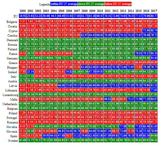
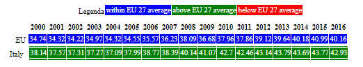
If you read "IT_USE_ii99 Internet users per 100 inhabitants", probably it is easy to understand what it means: it is a percentage, the more people use Internet, the better, if you are talking about creating a data-centric economy.
Look at this table: self-explanatory, it seems.
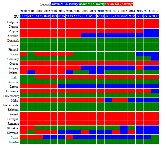
Now, the details explain the same story:
Of course, we are in reality ignoring few elements, such as:
- is the average income mix the same (as this might impact on access to technology)?
- is the average educational level the same (ditto)?
- are the access costs comparable (but this in Europe should be part of the convergence e.g. on roaming)
Now, what happens when instead you are completely out-of-the-line if you ignore those "background variables"?
Example 2: there is a story behind the numbers
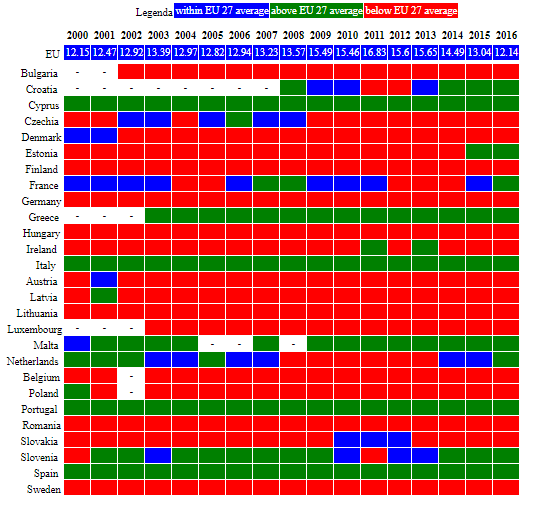
If you read: "NV_IND_SSIS Proportion of small-scale industries in total industry value added (%)", what does it mean?
This is an example of what you can get, by using averages and difference from averages:
Now, you should consider a couple of questions:
- does the EU have the same mix of small-scale industries all across Member States?
- does Italy economic structure match the "average EU"?
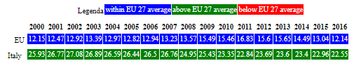
Keeping those questions in mind, have a look at what the "average of values" returns:
Now, in some Italian regions small-scale industries are (as number of units) well above 50% of the total.
Therefore, the first answer to those questions is: no, for NV_IND_SSIS does not make sense to consider the "EU average", and should be checked if the Italian economic structure matches the "EU average".
Moreover, just using this indicator to compare between countries would not make sense unless you factor in also other elements.
So, that indicator is within the dataset that I published on Kaggle this morning, but will not use it the way you see it: too many qualifications to check with raw data and the definition of the indicator ("metadata").
Anyway, my choice is just because expanding the analysis to make the indicator usable for my purposes (comparing EU 27 Member States across 2000-2018) would require work that isn't justifiable.
Instead, if you were to use the indicator to say, e.g. "in country X small companies represent Y% of the turnover, and Z% of investments, how does that compare with their share of the value added?", doing that additional number crunching and analysis makes sense- and, anyway, you would not be interested in comparing with a weighted EU average, or even just with other countries.
Instead, in my case, it makes more sense to use something whose object of analysis is harmonized.
If you read: "NV_IND_TECH Proportion of medium and high-tech industry value added in total value added (%)"- that's much more "linear".
Here is the table:
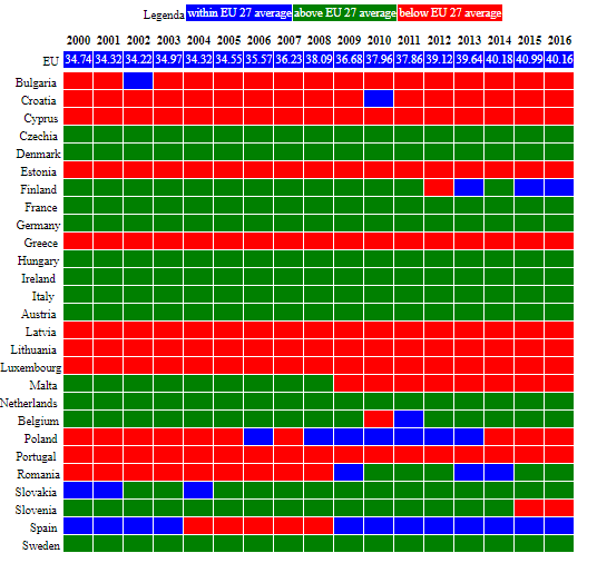
And these are the values:
Much, much easier.
Now, both on the "Internet users" and "value added" I wrote in the past, after attending workshops or presentations introducing the latest information from the territory where I live now in Italy (Piedmont).
And you can understand why, in the end, I will use just 6 out of the 7 within the dashboard
And what about that 7th plus the other 300+ indicators across further 30+ units of measure?
In due time, if needed...
For the time being... good data hunting.